
Romanian: Postul de fata este primul de pe acest blog pe care il scriu in limba engleza. Motivul este ca nu doar romani viziteaza blogul, ci si straini, cei mai multi intelegand engleza, si incercand uneori sa traduca via Google Translate; respectivele traduceri sunt insa mai mult decat slabe, in cazul multor paragrafe pierzandu-se sensul initial. Asa ca…
English: This will be my very first post in English. The reason is that some readers try sometimes to translate my posts via Google Translate, which makes no sense out of my writings. This is why, at least this post, will be written all in English. And I must apologies for many grammar/spelling mistakes that I will make along the way. Hopefully the meaning of the sentences and the important information (if any) will be understandable.
So…
This post will be about some long-forgotten lunar images from 2012. Back then, I was trying to create a large lunar mosaic, but eventually gave up due to unstable weather conditions and low battery on my laptop. I did however acquire images for almost a quarter of the Moon’s disc, but I’ve only processed the images a few days ago, when I’ve noticed some interesting results.
First, the technical data…
The images were acquired on September 30th, 2012 at around 00:15-00:45 U.T. The telescope used was a Celestron SCT 11″ F/10. In 2012 I was still using a DBK 41AU02.AS camera from Imaging Source (which I’ve unfortunately sold), coupled with a Baader IR-pass 685nm filter to reduce as much as possible the destructive effects of bad seeing conditions. The following images were all acquired at F/10, that is roughly 2800mm focal length. The entire setup was placed onto a SkyWathcer NEQ-6 equatorial mount. The software used was the Imaging Source’s own IC Capture.AS. For processing the images I’ve used Registax 6, AstraImage, Photoshop CS2 and Microsoft ICE.
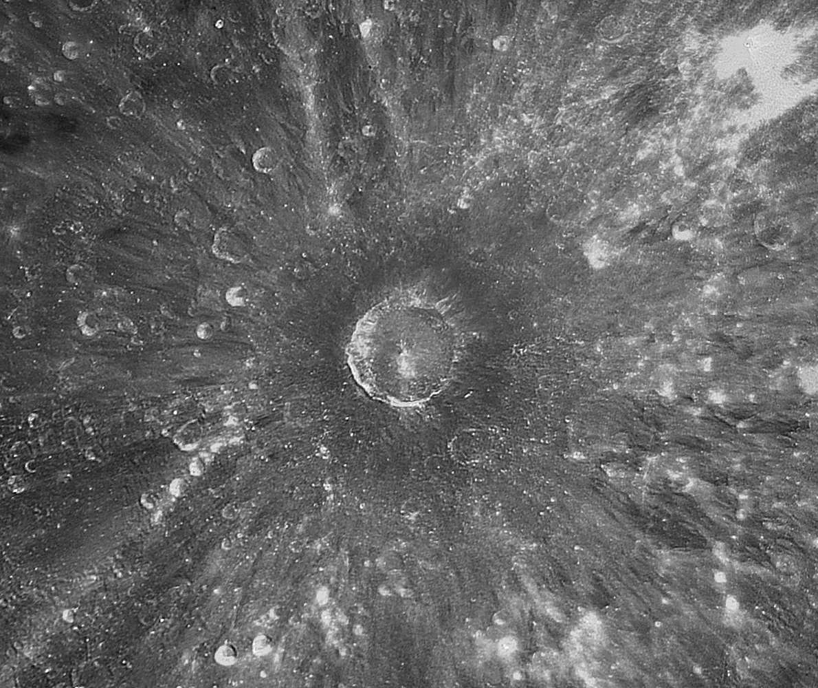
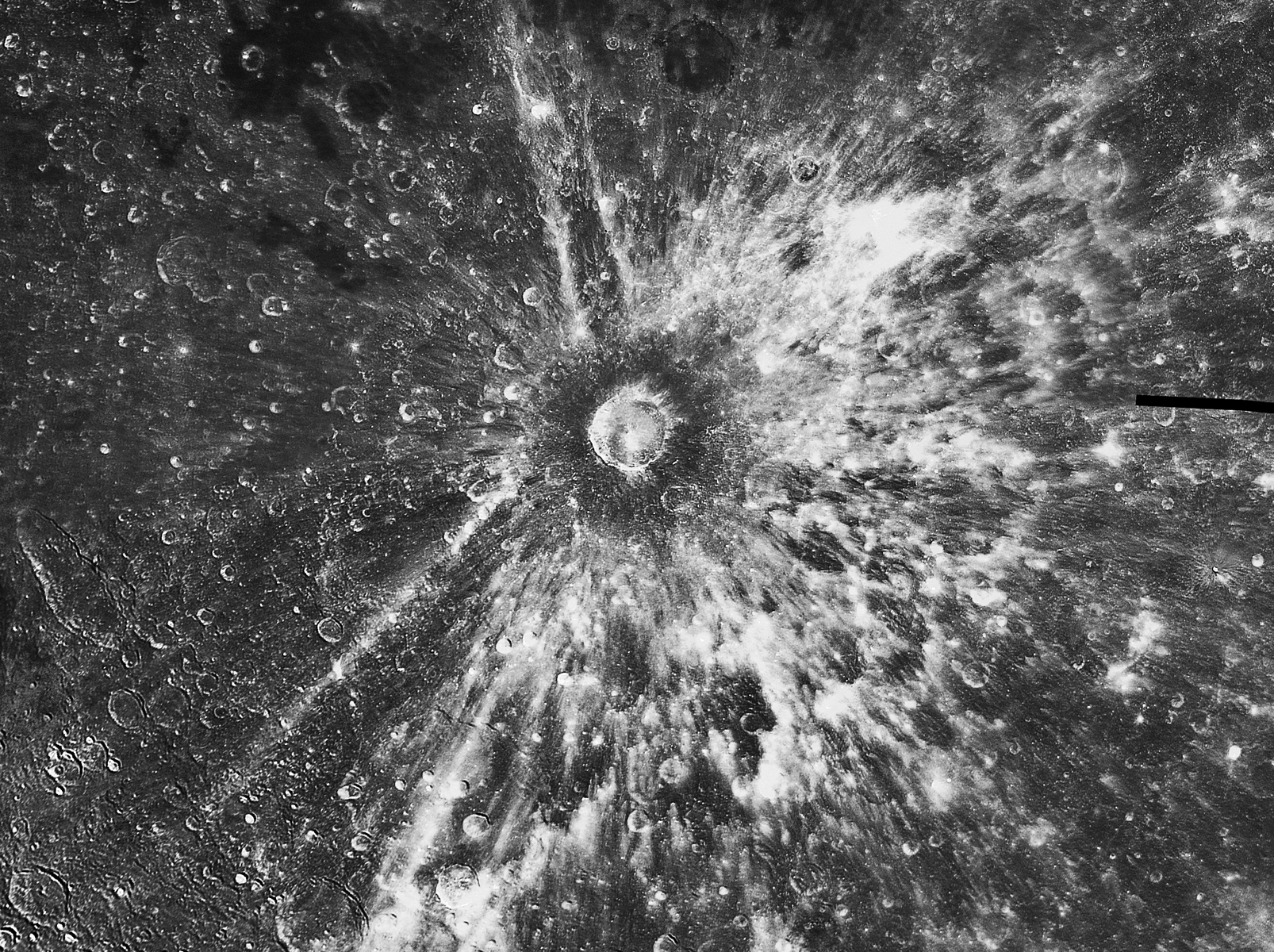
And now the image, which is actually a 6-frame mosaic, each image being created by stacking around 2000 frames. The image was processed in black-and-white, as most lunar images are processed. Due to some tracking problems, I could not get a perfect mosaic, as it can be seen in the right part of the image (the black horizontal line).
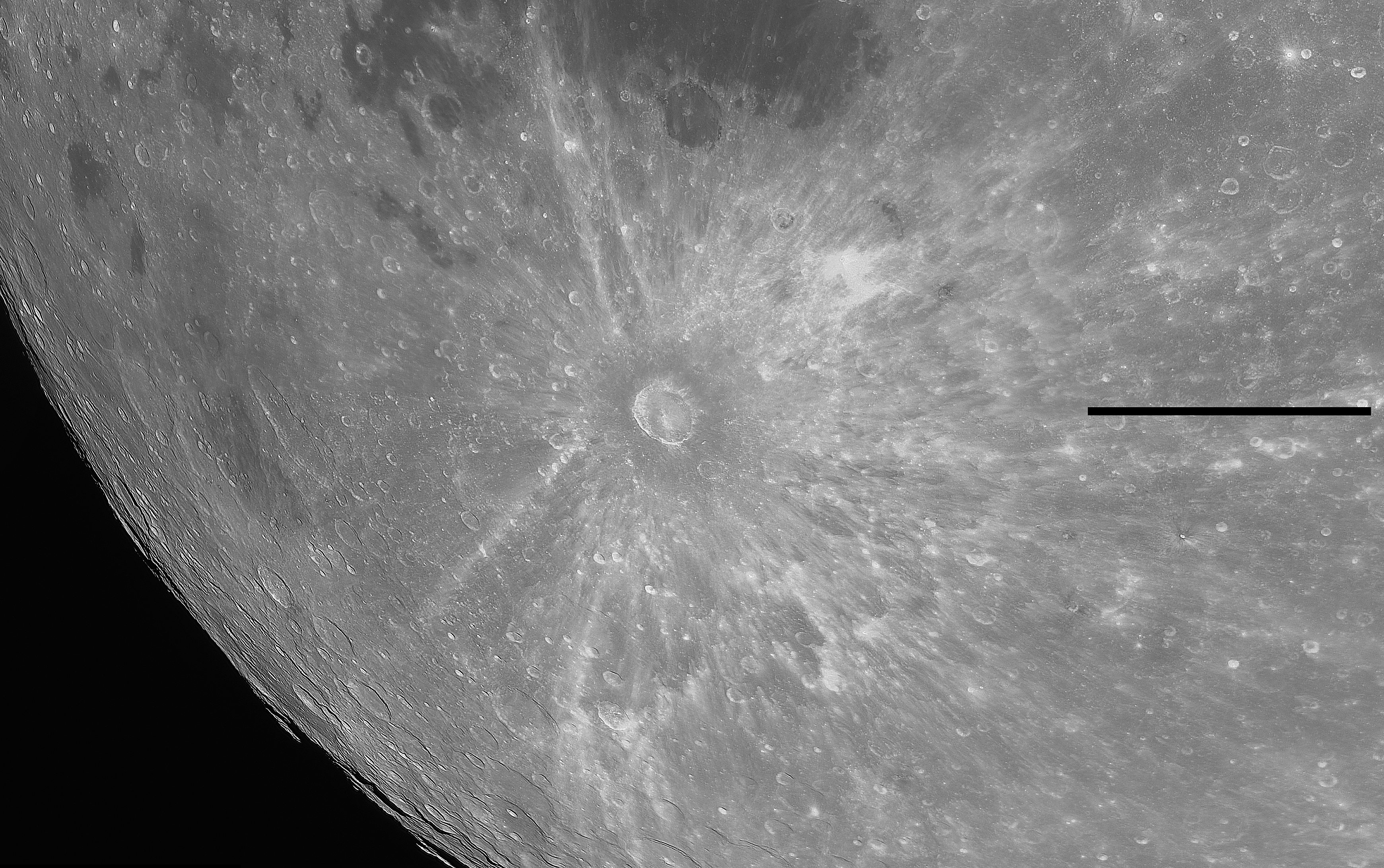
The above image adds nothing new to the understanding of the Moon, it has no superior resolution compared to other images, and it’s not aesthetically pleasant.
But…
The resulting data, after the first processing steps (stacking, deconvolution, wavelets) still carried with it some extra information: color!
How? Well, after some digging on the Internet I’ve found out some interesting facts.
The camera I was using, has a color sensor (of course I knew that) named ICX205 by the guys at Sony (the company which created it). This sensor, as any other sensor, has a specific light sensitivity at any given wavelength. This made me think about the actual part of the spectrum that I was imaging in. Of course I had to find the transmission plot of the IR-pass filter also. For this step I did however disregard the spectral sensitivity of my C 11 optics, which could not affect much my first conclusion (hopefully). So, I’ve overlayed the two spectral curves into the following plot:
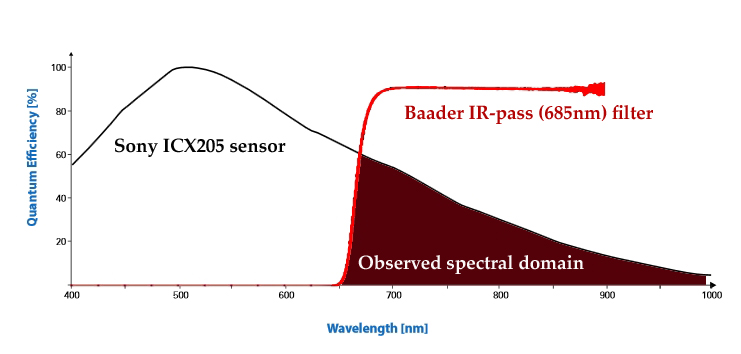
The transmission of the filter was taken from here, while the spectral sensitivity of the Sony sensor was obtained from here.
What is to be learned from the above plot is that the actual spectral domain in my images ranges from around 650nm to around 1000nm. So it’s quite large, and most of the light comes from red to near infrared.
This means that the resulting images should have been 99% RED in color. But they are not. This is mostly due to the camera’s auto white balance (AWB) which tries to correct the images as much as possible in terms of color levels. This means that despite the large Red-to-near IR spectral domain, the software tries to balance the colors to make the image close to RGB visual spectrum. But it can’t actually do that due to the IR filter. And this is actually good.
Why? Well, because otherwise my IR image would only present details and some albedo differences. But now, they present something more…
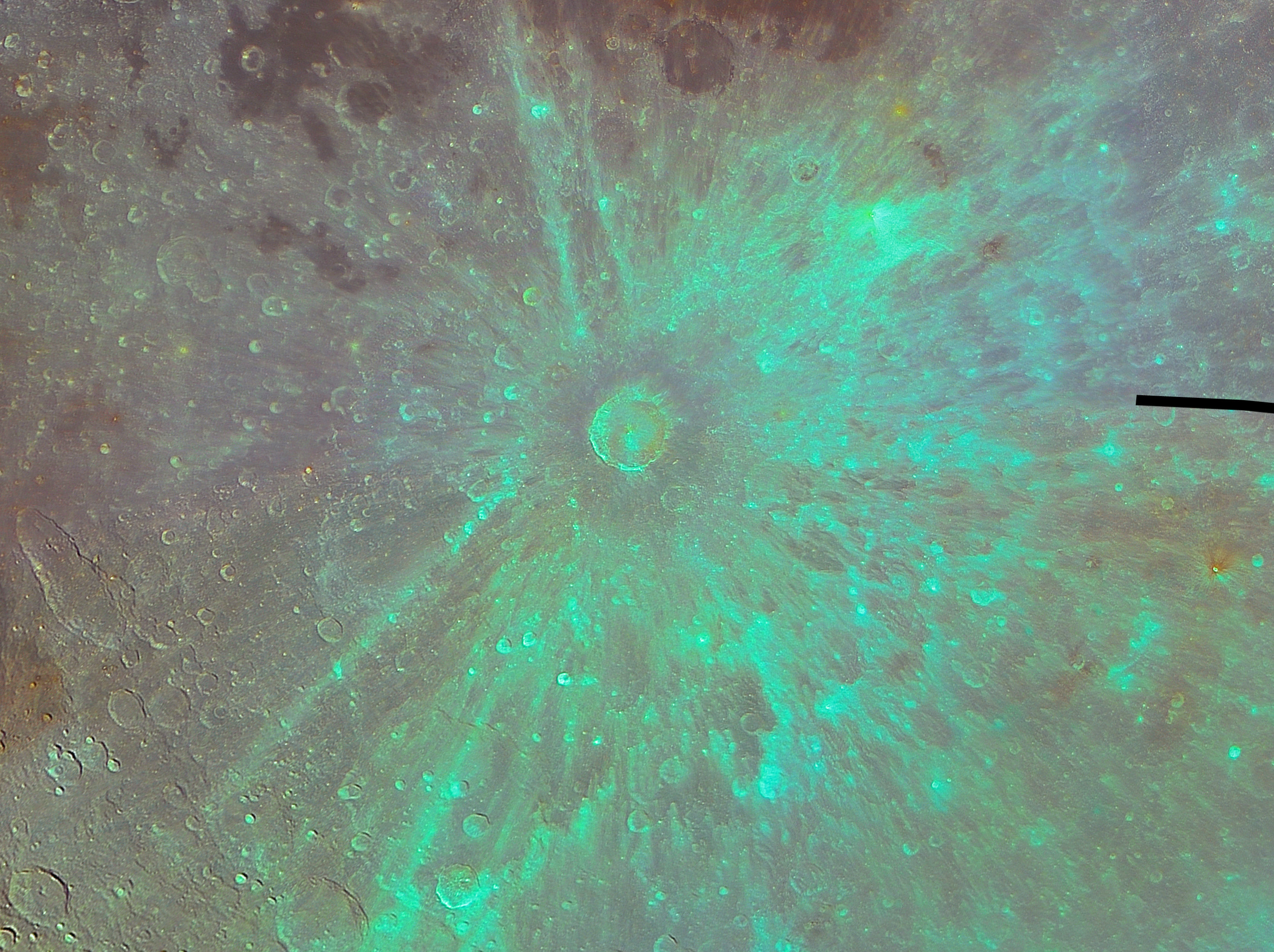
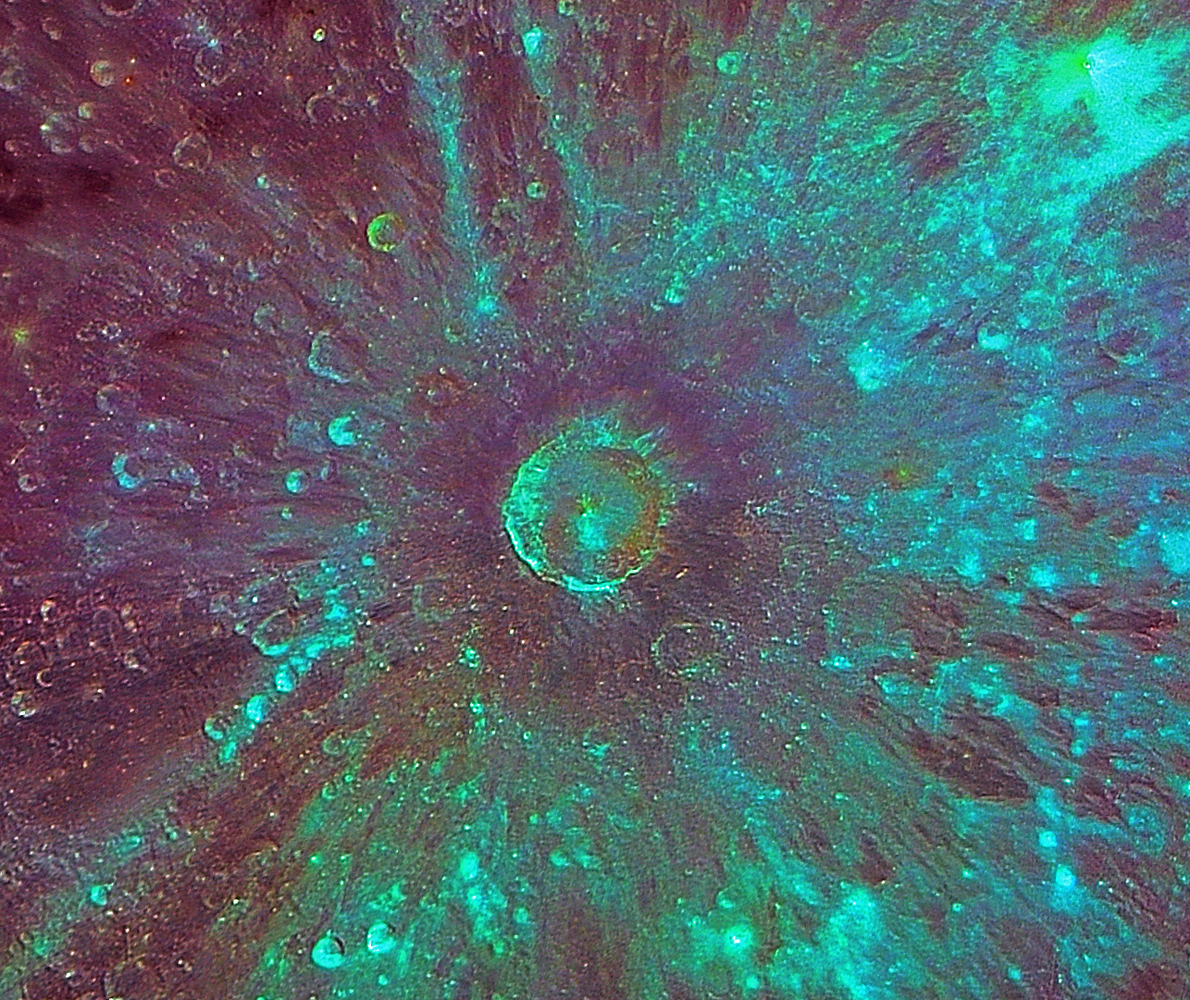
As an example, this is the Tycho image again, but with some extra processing, which I will explain in a moment:
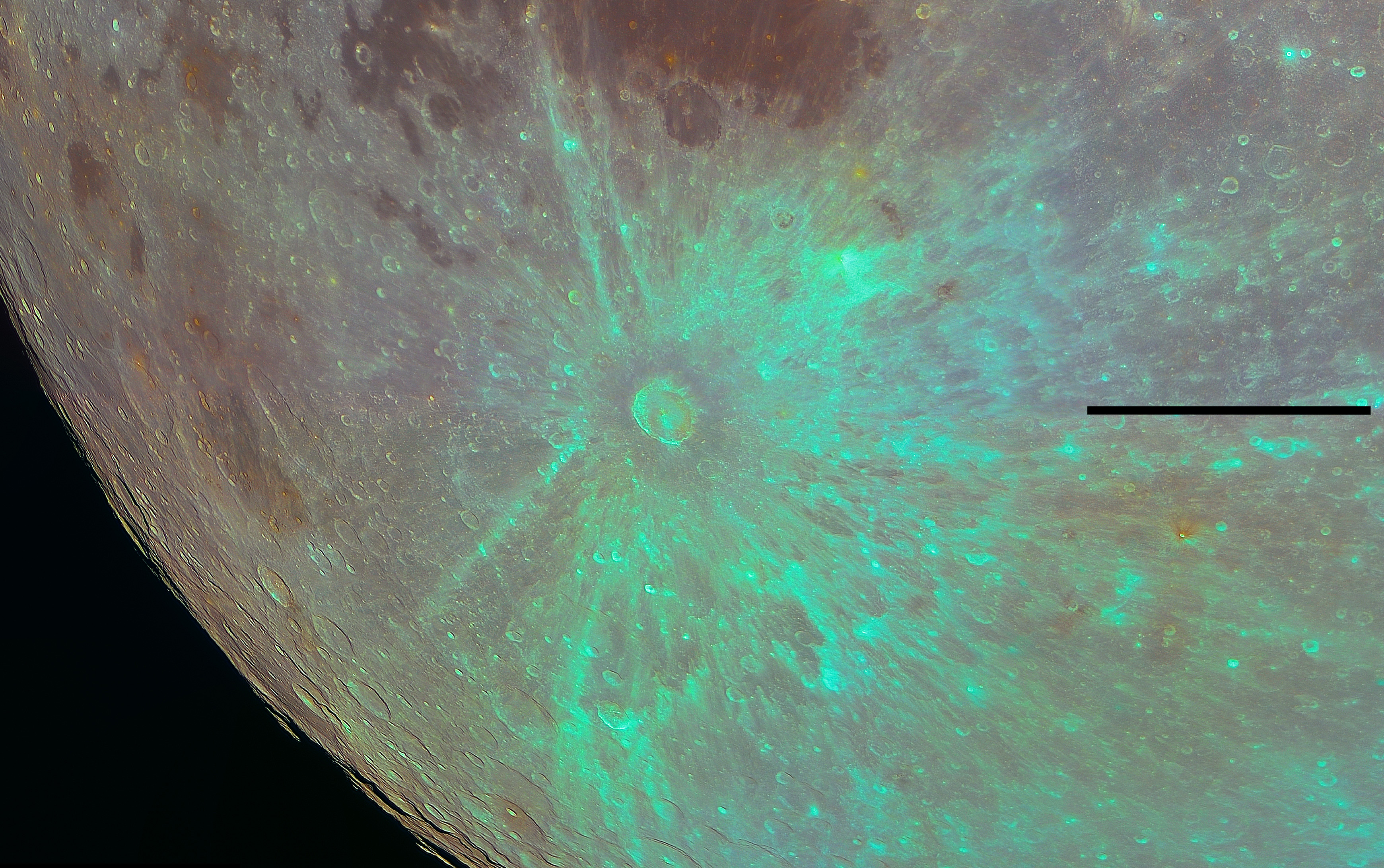
Now the image shows some interesting color variations, with Tycho’s rays dominating the view. The actual colors were over-saturated in Photoshop CS2 increasing the saturation three consecutive times, each time with a value of 60. The resulting color image was then overlayed onto the original image with some mild “Unsharp masking” applied. So no color degradation due to processing. This steps were performed for all of the composing images, after which they were automatically stitched in Microsoft ICE to create the mosaic.
It can be noticed that some color variations are slightly off, namely the horizontal large area starting from just above the black line and ending towards the left of the image. However, this slightly bluish region seems that it does not destroy the global color information of the image, so I did not re-process the image to correct this. At worst, it might be compared to the Clementine lunar probe color variations.
Now, about the information that can be extracted from colors. Normally, in the highly saturated color images in the visible part of the spectrum, like this or this, you have some information about the iron-rich or titanium-rich areas, that is some information about the general distribution of lunar minerals on the lunar surface. This is not the same with only one wavelength-imaging. But the IR-pass filter I’ve used, as shown above, does allow for images to cover a relatively wide range of the spectrum. And so, the colors in the last image above, do actually present different types of materials at the lunar surface.
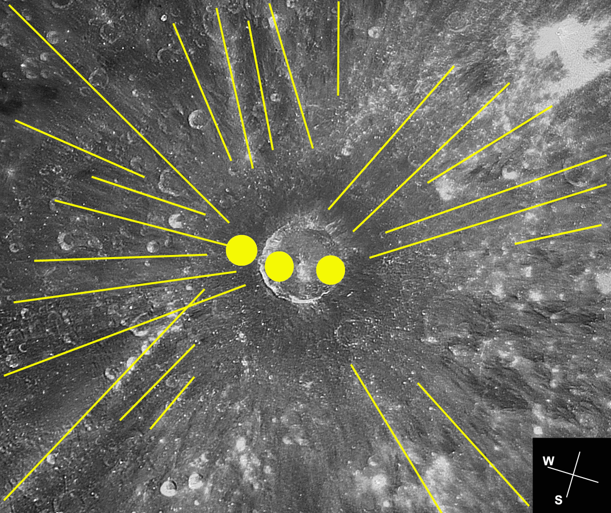
This is an example showing that the colors are not related just to albedo features, but do show some mineral variation as well.
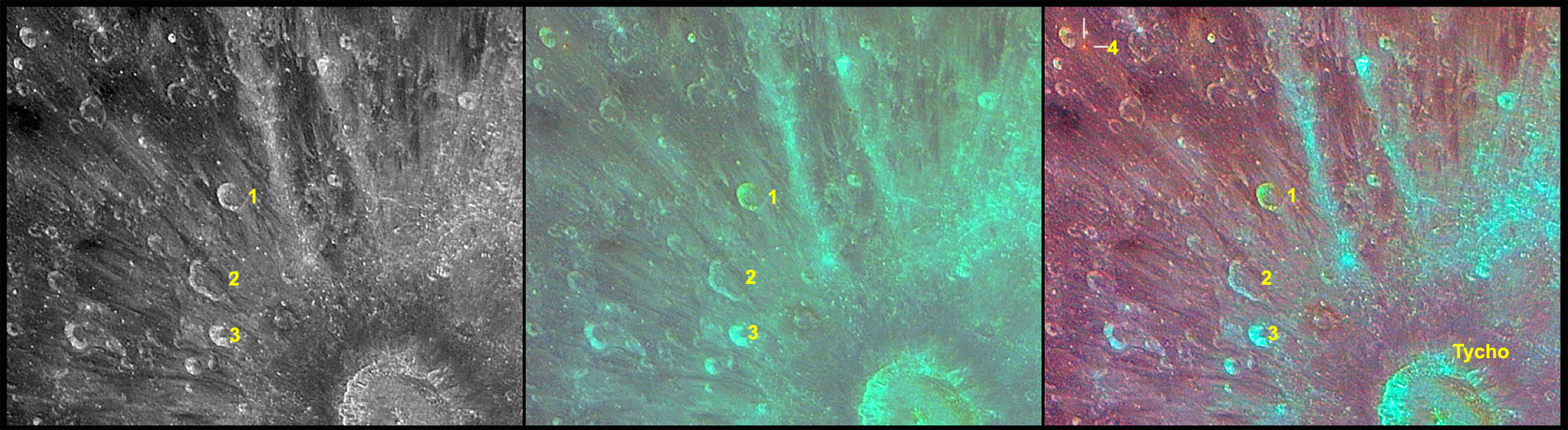
In the above image, first from left (black-and-white), the craters named 1, 2 and 3 have slightly different reflection coefficients, namely crater 2 seems the darkest, followed by crater number 1, and finally, the brightest of them, crater number 3. This is a normal processed black-and-white image acquired in IR. This image actually presents the albedo differences of lunar craters. But, the second image, which also adds the original color data (again the processing is the same as the wider view above), shows that crater 1 has a rather different color compared to the other two. It’s color can also be found inside Tycho. So, if these were only albedo-related colors, crater’s 1 color should have been the same or very similar to the other craters. But it is not. And this is even more obvious in the third image, which is basically the same as the second, but with a bit more processing via “auto levels” in Photoshop, and some brightness and contrast. There is also a small red-ringed crater (named 4, in the upper left corner, third image) which shows again that the colors don’t relate only to the albedo differences.
OK, so I think I’ve elaborated enough about why I think the colors do show something more than just brightness variations. Now I’m getting to the interesting part…
To better illustrate what crater Tycho’s initial impactor (asteroid) did on the Moon, I’ve used a Photoshop trick to correct for the perspective and have the crater looking like it was imaged from above. This was done using the 3D Transform filter, as presented here. It really changes the perspective of lunar observers used to the never-rotating (or slightly-rotating) Moon at the eyepiece or onto the laptop screen (like myself).
The resulting “corrected” image:
Now Tycho looks circular. And it’s not the only one…Look at the following image for some other major craters that had their shape “corrected”:

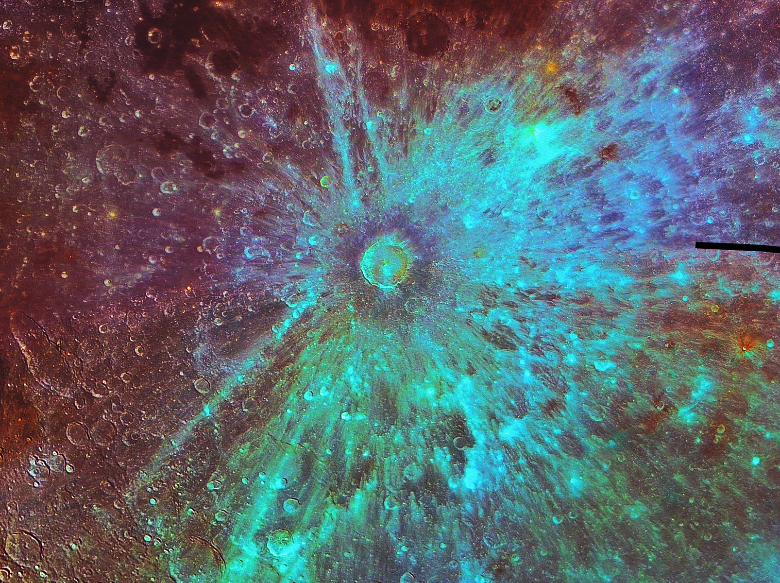
Of course, after applying the “auto levels” in Photoshop, the entire image looks much more interesting, and some of the otherwise low-contrasted features start being visible much easier:
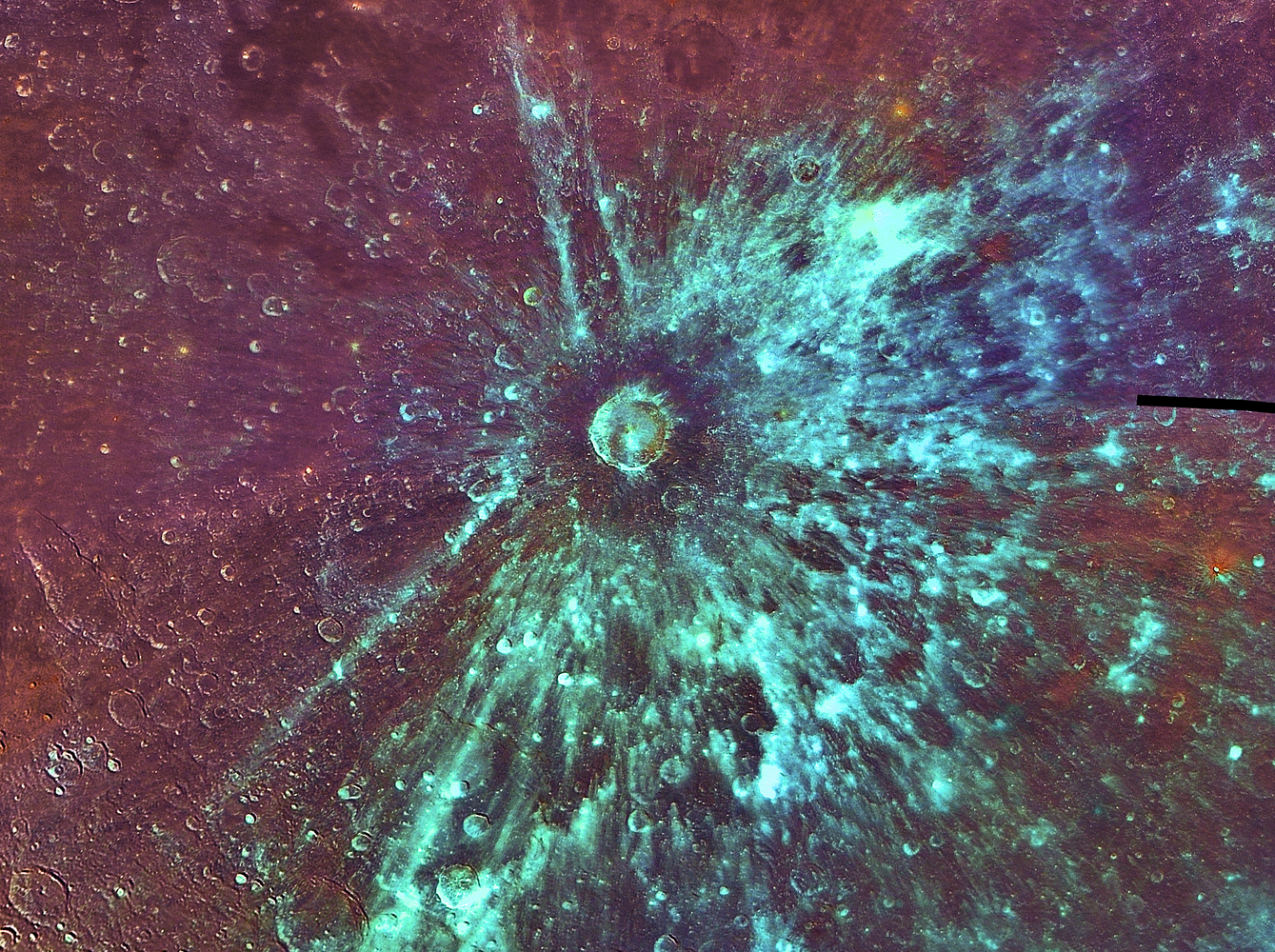
A lot of colors. And interestingly, again, they tend to represent different geologic features, like cyan for the rays of Tycho. Also, notice how some of the rays cut the floor of Clavius.
A comparison of three images, black-and-white, colored and gradient map (in Photoshop) which show the different views of the Tycho rays complex:
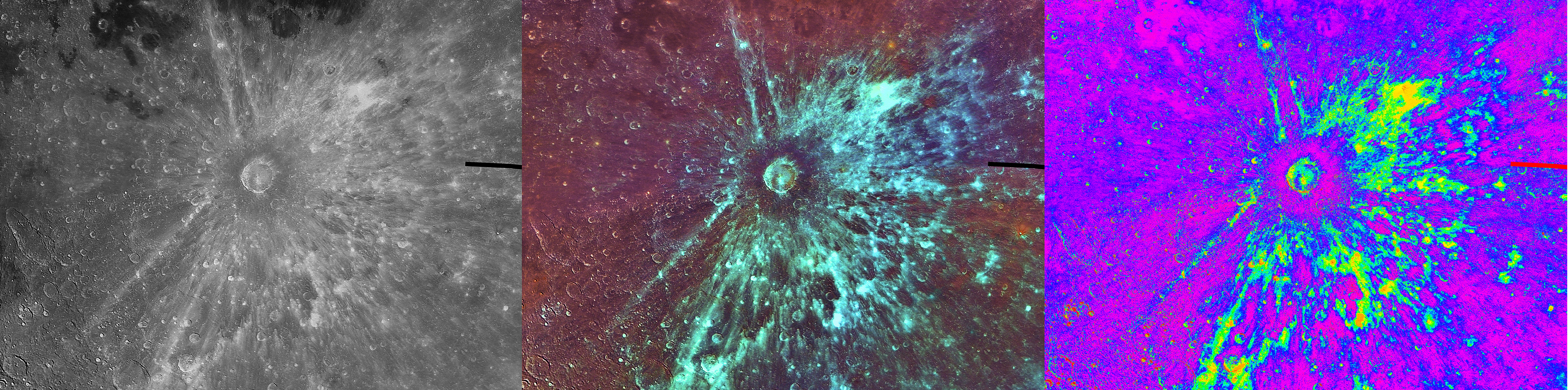
The gradient map shows in high contrast the Tycho rays complex, and so I’ve decided to put some schematics on the image also. First, something worth mentioning here is that Tycho is thought to have been created by an oblique impact. This is the same process that created many craters on the Moon, one of which is Messier. The shape of the rays in the case of Messier proves the oblique impact theory. And the same can be applied to Tycho as well. So, I’ve named the lateral rays of Tycho accordingly to the same areas around Messier: butterfly wings, with north and south divisions. And drawing their shape as good as I could, I can now say something which others (including Chuck Wood in the above linked Sky&Telescope article) know for some time now: Tycho must have been formed by an asteroid coming from the lunar West. The drawing with the impactor’s trajectory:
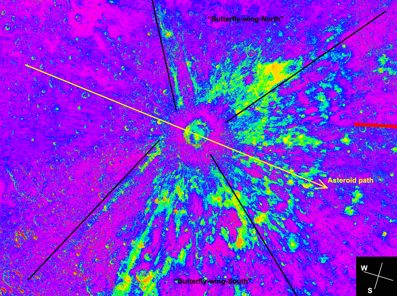
Of course there are plenty of degrees for margin of error in the above image, but the general West to East trajectory is good.
Now, something about another information that can be extracted from the above images. Again, this is not something new, but it does add some value to amateur images.
It was observed before that the Tycho rays don’t actually converge into a single impact point, but rather in three areas in and near the crater.
I’ve also traced back some of the bright and dark rays, and made a similar observation:
This is also similar to Messier’s pattern, with the margins of the butterfly wings intersecting just outside the crater’s rim.
And, at the end of this post, another comparison between the perspective-corrected black-and-white and color images of Tycho, this time focusing only on the crater and it’s immediate surroundings.
Black and white image:
Color image:
Notice the different colors inside the crater, and also the darker ring just outside the crater.
As a conclusion:
I’m not a lunar scientist, and have very little knowledge of the mineralogy of the lunar surface. So I cannot say for sure what minerals are represented in my images by each color. But I can say that they do present true differences in materials, perhaps combined with some albedo differences as well. I can only hope to eventually trace this colors to their true significance. And also to process a lot more data taken in that night…
Max
(March 3, 2014)
UPDATE: Two new versions of the Tycho image:
One of this latest images was selected as LPOD for March 4, 2014.

2 Replies to “Tycho”